Slide Deck Hack: Creating Sidebars for Student Content Navigation
The Issue:
For many presentations I give throughout the year in different programs of my University, my slide deck inevitably ends up being the core study material for my students. While flipped classroom models and use of adjuntive material (e.g. videos/Youtube) have cut down on the amount of slides and time spent in class on cases and material, the slide deck still reigns supreme.
One item I have been playing with is the content of my slides and trying to make the design more uniform in design. Recently, with changes to Microsoft Powerpoint, and hardware changes in the classroom, widescreen slide set-up have become easier. I love the extra space and the ability to incorporate images easier. That being the case, I set out to try to make my slides easier to navigate for my students during lecture.
Building a Roadmap:
Usually for my lectures I present a roadmap of what the lecture will cover and significant events, such as quizzes or assignments expected.
Example roadmap in a lecture about burn and wound care for pharmacy students.
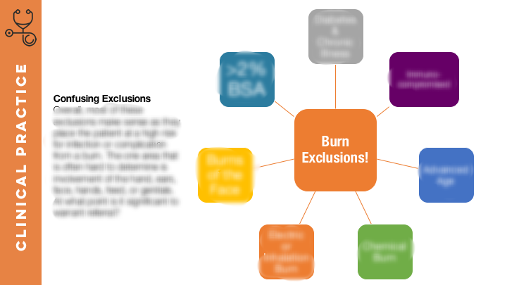
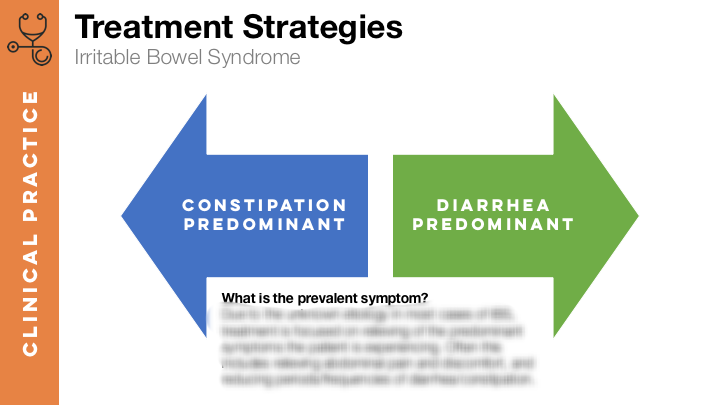
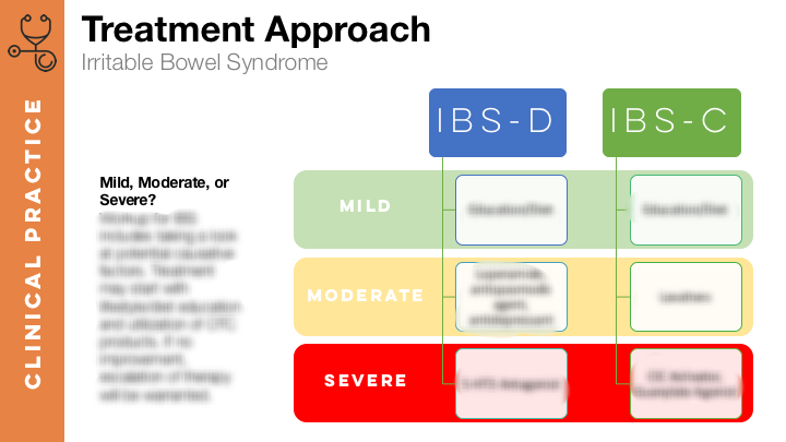
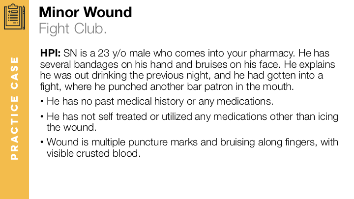
What I have also started incorporating is the use of slidebars into my lectures to allow students to identify the purpose of each slide.
Side bars for a Self Care Lecture based on core content discussed.
Example Slides
Below are sample slides I have created for several lectures where I will be piloting this concept. I will be seeking student feedback if these changes help the students better navigate their lectures and make the content easier to follow.
Note:I have grayed out some slides to preserve material for internal use in my lectures.
